St. Paul Public Works
“This website has good UI and feels like it can inspire confidence”
Maddie N
Background
This case study examines the usability of the Trash and Recycling section of St. Paul’s Public Works website. While participants generally found the site easy to navigate, they identified areas where it lacks consistency and contains redundancies that could hinder the user experience.
Role: Researcher
Date: October, 2024
Methods: Heuristic Evaluation Think-aloud protocol
Tools: Google Slides, Google Docs, Google Sheets, Zoom
Defining the Problem
St. Paul is home to approximately 303,176 residents, making waste and recycling management a significant responsibility for the city’s Public Works Department. With such a large population, the department faces a constant influx of questions and concerns from residents. To ensure efficient communication and service delivery, it is crucial for the website to be user-friendly and intuitive, enabling residents to quickly find the information they need and minimizing potential frustrations. A well-designed website is essential for the department to function smoothly and effectively.
In 2018, the waste diversion rate in St. Paul was around 24%. The city’s goal was to reach 50% by 2021.
stpaul.gov
A mere 11 percent of plastic waste in Minneapolis is ultimately recycled. The rest is incinerated perpetuating a system in which vulnerable groups are exposed to high levels of pollution.
sahanjournal.com
Purpose
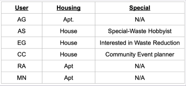
For this project, I sought to gain insight into the usability of St. Paul’s Public Works website. My primary focus was on understanding the needs of single-family household residents and multi-unit apartment dwellers, as they represent the majority of users engaging with the site’s trash and recycling services. Additionally, I explored two secondary audiences: community event planners, who often require information about waste management for gatherings, and special waste-generating hobbyists, such as DIY enthusiasts or gardeners, who may have unique disposal needs. This comprehensive approach allowed for a broader understanding of user expectations and pain points.
Iteration and Evaluation
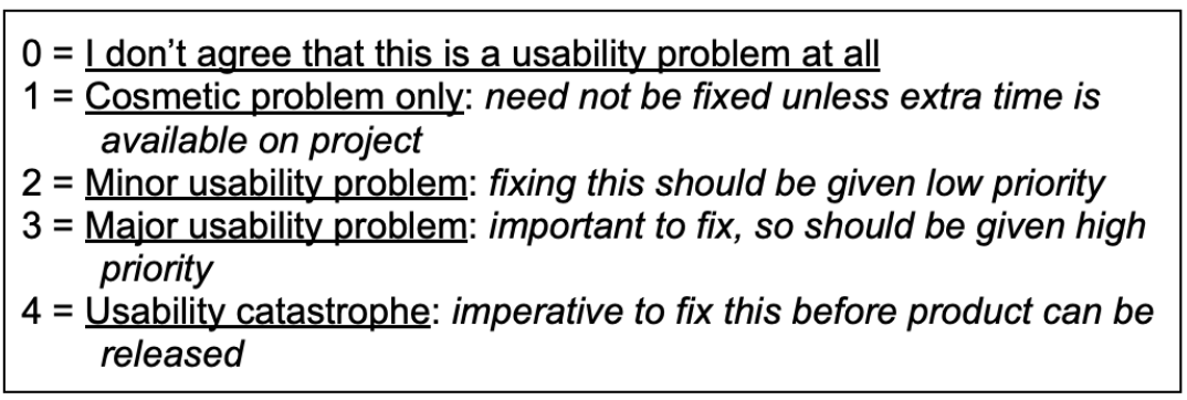
To assess the site’s usability, I began with a heuristic evaluation. Working alongside a team of five, we systematically reviewed the website to identify areas where it violated established heuristic principles of usability. This process allowed us to pinpoint inconsistencies, inefficiencies, and other issues that could hinder the user experience. By leveraging a structured evaluation method, we gained valuable insights into the site’s strengths and areas for improvement.
Following the heuristic evaluation, I synthesized our findings and worked collaboratively with the team to identify key areas of focus for think-aloud protocol interviews. We conducted six interviews, ensuring a diverse range of perspectives: three single-family homeowners and three apartment dwellers formed the primary participant group. Additionally, the sample included a community event planner and a hobbyist who frequently deals with disposing of unconventional waste, particularly various types of metals. This approach provided a well-rounded understanding of the site’s usability across different user needs and contexts.
During the think-aloud protocol sessions, additional data was gathered, analyzed, and synthesized to identify recurring themes and user challenges. This process informed the creation of a comprehensive Findings and Recommendations Report, outlining key usability issues and actionable improvements to enhance the user experience of St. Paul’s Public Works website.
Among the positive key findings were the following:
1. Participants had an overall positive reaction to the aesthetics of the design of the website.
2. Images and icons encouraged a positive interaction with participants.
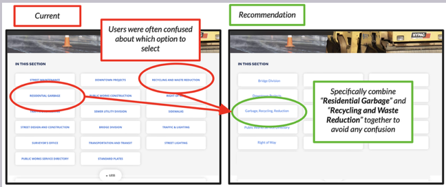
3. Eliminate the dropdown features for the section selections. Many users didn’t notice the “more” icon until navigating became frustrating for them.
Among the recommendations for change were the following:
1. Consolidate options that are redundant. This will help navigation to be less confusing.
2. Alphabetize the navigation bar.
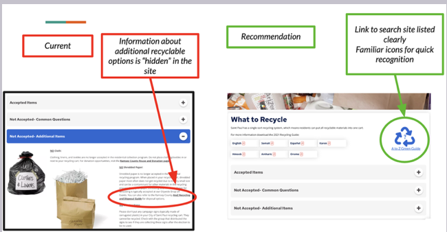
4. When participants investigated what could and could not be recycled, they often could not find specific items that they were searching. Adding a search menu in this section would help alleviate many phone calls from confused recyclers.
Overall, participants expressed positive impressions, opinions, and insights regarding the usability of the St. Paul Public Works website.
On average, participants rated the site’s usability at 4 out of 5, with 5 being the highest score. They noted that with a few targeted improvements, frustration levels could be significantly reduced, and the need to contact the office for clarification would decrease.
Introducing interactive features to the calendar section could further enhance user engagement, drawing more attention to events and resources. This improvement has the potential to reduce the overall volume of trash and recyclable pickups, aligning with the city’s waste management goals.


